Smart Strategies & Upgrades
Selecting a paint color requires more than simply picking a favorite swatch; it demands an understanding of undertones, light reflection, and how the hue interacts with your countertops, hardware, and plant life. The following nine kitchen cabinet colors consistently deliver a high-end, bespoke appearance that anchors current interior trends while remaining remarkably timeless.
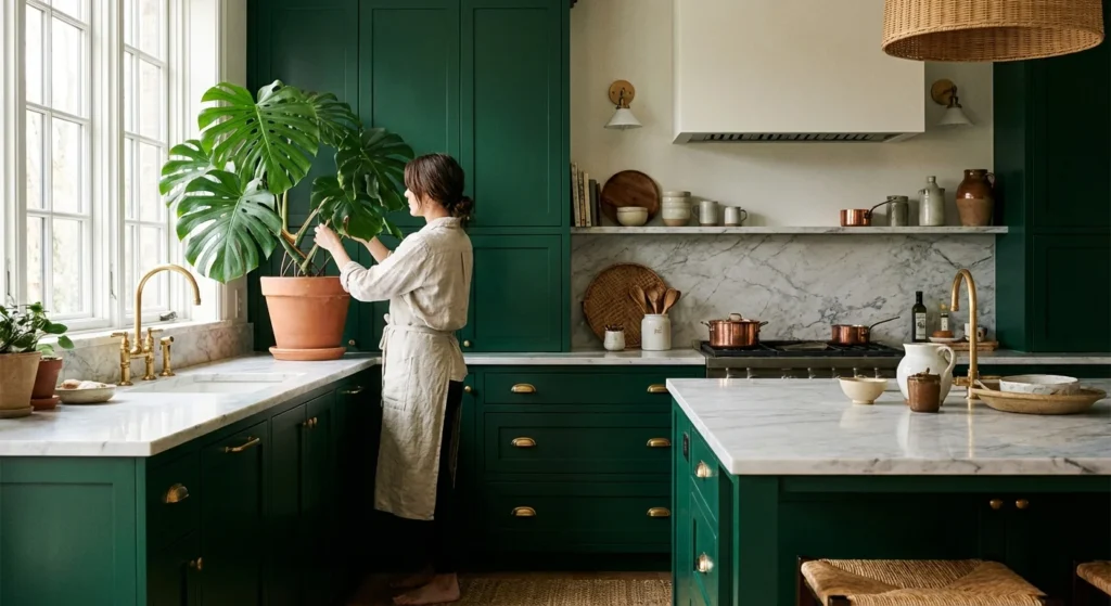
1. Deep Emerald Green
Emerald green carries an inherent sense of history and opulence—it evokes images of classic European estates, lush botanical conservatories, and dense, thriving forests. When applied to kitchen cabinets, this deep, saturated hue instantly makes standard doors look entirely custom and expensive. The secret to its luxurious appearance lies in its ability to absorb and reflect natural light, shifting subtly from a vibrant jewel tone in the morning to a moody, dramatic shadow by dusk.
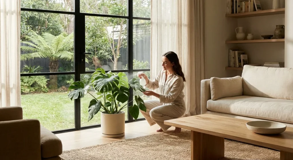
Deep green provides a phenomenal backdrop for indoor greenery. Imagine the striking contrast of a variegated Philodendron Birkin or a trailing neon Pothos resting on an open shelf directly above emerald base cabinets. To maximize the sophisticated feel, pair these dark green cabinets with unlacquered brass or polished gold hardware. The warm metallic tones pop brilliantly against the dark paint, creating a timeless aesthetic. Furthermore, rich greens hide everyday scuffs beautifully, offering a practical upgrade for a busy household.
2. Rich Navy Blue
If you desire drama without venturing into black, rich navy blue stands out as an exceptionally smart choice. Navy operates almost like a neutral in the design world, anchoring the kitchen while providing a crisp, tailored appearance. This color instantly elevates the perceived quality of the cabinetry, especially when paired with bright white quartz countertops or natural marble veining.
Navy cabinets thrive in kitchens that receive ample southern or western sunlight; the bright light highlights the blue undertones, preventing the space from feeling cavernous. From a botanical perspective, navy blue offers a spectacular contrast to the bright green fronds of a Majesty Palm or the structured leaves of a Zamioculcas zamiifolia (ZZ plant) positioned in a bare corner. When assessing resale value, real estate data frequently highlights navy blue islands and lower cabinets as highly desirable features that attract modern buyers.
3. Warm Mushroom (Greige)
Stark whites can sometimes feel clinical or cold, which is why warm mushroom—a delicate blend of gray and beige—has dominated recent interior trends. This earthy, organic color brings a quiet luxury to the kitchen. It mimics the gentle, grounding tones found in nature, making your space feel incredibly inviting and high-end.
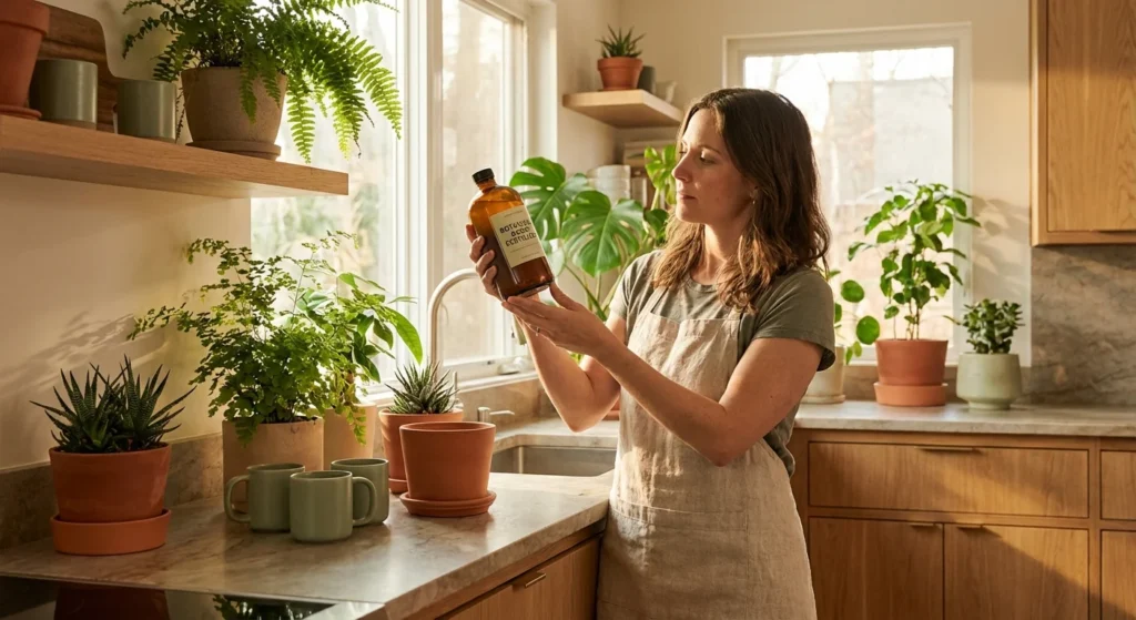
Mushroom cabinets excel in kitchens with northern exposure, where the natural light tends to be cooler and bluer. The warmth of the paint counteracts the chill of the light, establishing a cozy environment. Because this color is so soft and understated, it allows the textural elements of your kitchen to shine. Hand-tossed ceramic bowls, woven baskets, and the deeply textured leaves of a Monstera Deliciosa look completely at home against a mushroom-colored backdrop. It is a forgiving color that subtly hides dust while projecting refined elegance.
4. Charcoal Black
Embracing charcoal black cabinetry requires confidence, but the payoff is an ultra-expensive, highly sophisticated aesthetic. Unlike a flat, jet black, charcoal carries subtle gray or brown undertones that soften its impact, ensuring the kitchen feels luxurious rather than severe. Charcoal cabinets create a sleek, modern foundation that makes every other element in the room command attention.
To pull off charcoal successfully, balance is crucial. Utilize light-colored backsplashes, reflective glazed tiles, and abundant natural light to keep the space feeling open. This color strategy provides a magnificent stage for your indoor garden. The stark contrast between charcoal cabinets and the vivid, lime-green foliage of a Lemon Lime Dracaena creates an architectural, gallery-like feel. For hardware, brushed nickel or matte champagne bronze introduces a tactile richness that completes the high-end look.
5. Soft Sage Green
Biophilic design—the practice of connecting interior spaces to nature—continues to shape home improvements, making soft sage green a top contender for luxury kitchens. Sage is inherently calming; its muted, silvery undertones evoke the tranquility of a robust herb garden. This color feels bespoke and artisanal, instantly upgrading the ambiance of the room.
Sage green cabinets work harmoniously with natural wood tones, such as floating walnut shelves or butcher block countertops. This palette practically begs for an indoor culinary garden. Lining your windowsill with terracotta pots full of basil, rosemary, and thyme enhances the organic, expensive feel of the sage paint. Because it is a mid-tone color, it provides enough contrast to look intentional while remaining light enough to keep a smaller kitchen feeling spacious and airy.
6. Creamy Off-White
While brilliant, pure white kitchens enjoyed a long reign, the trend has decidedly shifted toward creamy, nuanced off-whites. Colors with a hint of vanilla or clotted cream eliminate the sterile hospital vibe and replace it with historical elegance. Off-white cabinets look thicker, richer, and decidedly more custom than their bright white counterparts.
This color strategy acts as a phenomenal light multiplier, bouncing sunshine into every corner of the room. If your kitchen houses high-light plants—such as a blooming Anthurium or a collection of sun-loving succulents—creamy off-white walls and cabinets will help maximize their photosynthetic potential by reflecting light onto the undersides of their leaves. Pair this shade with dark bronze hardware to anchor the lightness and introduce a touch of rustic sophistication.
7. Slate Blue-Gray
Combining the stability of blue with the neutrality of gray, slate is a masterful chameleon color. Depending on the time of day and your light bulbs, slate blue-gray can read as a stormy ocean or a soft, moody neutral. This complexity is exactly what makes it look expensive; builder-grade colors rarely possess this level of depth.
Slate blue-gray offers excellent longevity and durability in high-traffic kitchens. The gray undertones effectively camouflage smudges and fingerprints—a vital comfort improvement for families. Design-wise, it pairs seamlessly with stainless steel appliances, creating a cohesive, professional-grade cooking environment. Introduce a splash of organic warmth by placing a vibrant, red-edged Peperomia or a cascading string of hearts on the countertop to soften the cool tones of the cabinetry.
8. Moody Plum or Burgundy
For a truly unexpected and lavish kitchen design, consider deep plum or muted burgundy. These rich, wine-inspired hues are stepping into the spotlight as homeowners look for unique ways to express their personal style. Deep reddish-purple tones have historically been associated with royalty and luxury; applying them to cabinetry transforms the kitchen into a jewel box.
Because these colors are visually heavy, they often work best applied strictly to base cabinets or a central island, paired with lighter uppers. This two-tone approach is an excellent aging-in-place strategy, as the distinct contrast helps clearly delineate the floor plan and storage areas for those with changing vision. Moody plum provides a stunning visual contrast to silver-toned foliage, making plants like the Begonia Maculata or a Silver Satin Pothos absolutely pop against the rich background.
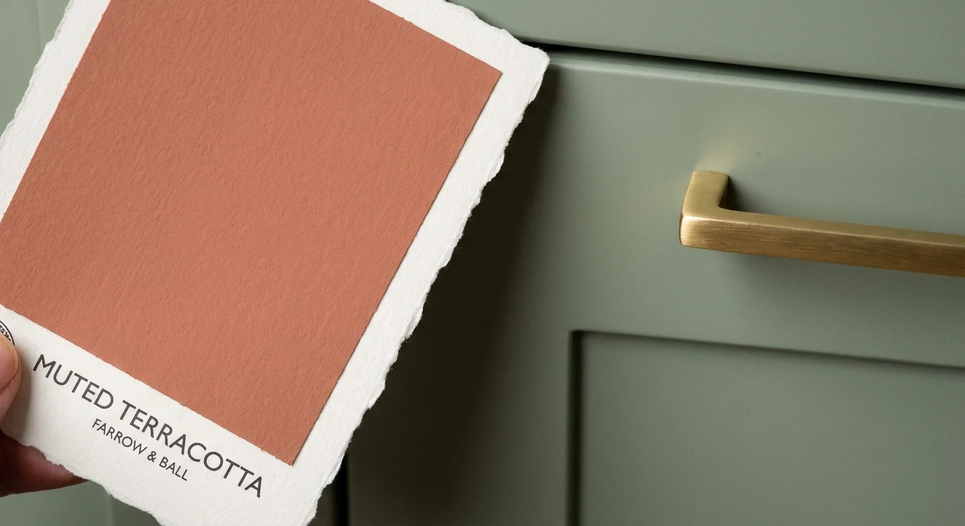
9. Terracotta or Baked Earth
Warmth is making a massive return to kitchen design, and earthy terracotta shades offer a sun-baked, Mediterranean luxury that feels incredibly grounded. Terracotta translates to “baked earth,” and painting your cabinets in this dusty, clay-inspired hue infuses the space with instant architectural character. It avoids the harshness of primary red and instead provides a soft, enveloping warmth.
Terracotta cabinets thrive alongside natural stone floors and textured zellige tile backsplashes. This color actively complements your plant collection by mirroring the clay pots in which many botanicals reside. The visual synergy between terracotta cabinets, matching plant containers, and the deep green of a Ficus Elastica (Rubber Tree) establishes a cohesive, highly designed environment that drastically elevates the perceived value of your home.