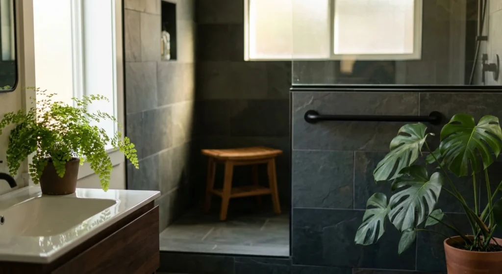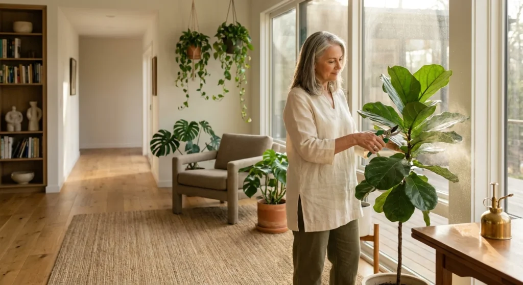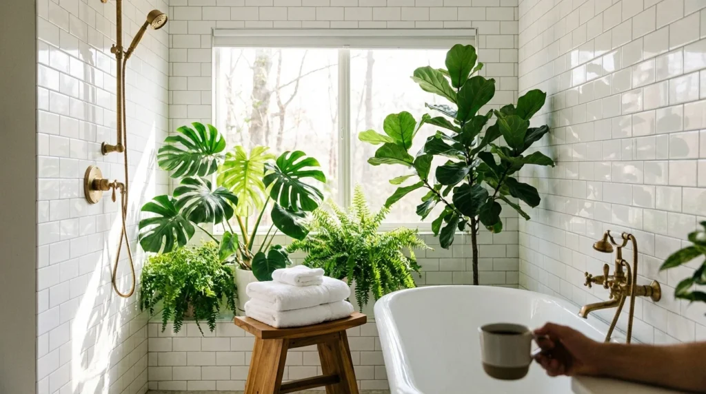
Tearing out solid oak cabinets costs thousands of dollars and discards durable, high-quality wood. The right wall paint transforms your space immediately by balancing heavy grain and neutralizing dated orange undertones.
You do not need a gut renovation to create a fresh, magazine-worthy kitchen. Choosing complementary wall colors turns traditional golden or red oak into a stunning, intentional architectural feature.
Discover eleven designer-tested paint colors that elevate oak cabinetry. We will examine light reflectance, color theory, and styling accents that deliver a cohesive, modern home aesthetic.
Decoding Oak Undertones: Orange, Red, and White Oak
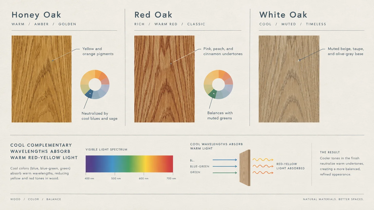
Before buying paint samples, you must identify the primary undertone living in your wood grain. Honey oak from the 1980s and 1990s usually carries heavy yellow and orange pigments.
Red oak displays distinct pink, peach, or cinnamon undertones within its prominent cathedral grain lines. In contrast, modern white oak exhibits muted beige, taupe, and subtle olive-gray base notes.
Color theory governs how your eye perceives these wood tones against kitchen walls. Colors situated directly opposite your cabinet shade on the color wheel create dynamic visual contrast.
Cool blues and crisp greens neutralize warm orange hues by absorbing red-yellow wavelengths of light. Analogous warm neutrals, such as creamy linens and soft taupes, create a continuous, cozy flow.
Lighting also fundamentally changes your paint selections throughout the day. North-facing light casts cool blue shadows, while south-facing exposure bathes your kitchen in warm golden light.
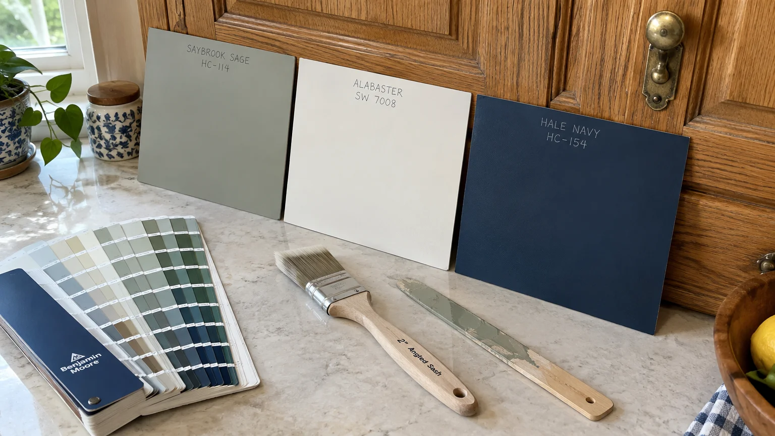
11 Paint Colors That Flatter Oak Cabinets
Explore these eleven curated wall colors oak kitchen designs rely on to balance wood grains and brighten interior spaces.
1. Soft Sage Green: Benjamin Moore Saybrook Sage (HC-114)
Sage green acts as the ultimate antidote to brassy honey oak. Because green directly opposes red and orange on the artists’ color wheel, sage softens aggressive wood tones.
Saybrook Sage carries a gentle gray undertone that keeps the kitchen feeling tranquil rather than loud. This earthy mid-tone provides enough depth to anchor bright daylight without dimming windowless prep areas.
Pair this hue with matte black pulls and crisp white subway tile for an updated farmhouse aesthetic. The soft gray-green background allows the oak’s organic wood grain to read as warm and intentional.
2. Warm Off-White: Sherwin-Williams Alabaster (SW 7008)
Bright, stark whites often clash harshly against honey oak, making the wood appear artificially aged. Sherwin-Williams Alabaster provides a soft, creamy alternative that reflects abundant daylight.
With a Light Reflectance Value (LRV) of 82, Alabaster keeps dark kitchens feeling spacious and bright. Its balanced beige undertone flatters golden oak without leaning yellow or dingy.
Use Alabaster on your walls and ceiling to establish a seamless, open envelope. Add brushed brass hardware to tie together the warm wall glow and the cabinet face frames.
3. Moody Classic Navy: Benjamin Moore Hale Navy (HC-154)
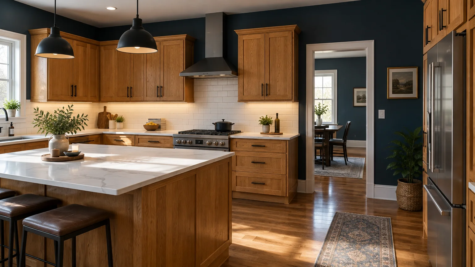
If you prefer dramatic, saturated contrast, a deep navy wall creates immediate sophistication. Benjamin Moore Hale Navy brings a grounding presence that modernizes vintage oak.
The blue-black depth of navy pulls visual focus outward, turning your oak cabinets into warm statement furniture. It works exceptionally well in kitchens featuring expansive natural light or tall vaulted ceilings.
Balance dark navy walls with bright quartz countertops and warm recessed downlights. You can explore creative layout inspirations on Houzz to see how designers style saturated blue walls against natural timber.
4. Balanced Greige: Sherwin-Williams Agreeable Gray (SW 7029)
Pure cool grays often make warm oak look sickly and yellow by comparison. Sherwin-Williams Agreeable Gray solves this dilemma by blending cool gray with a healthy dose of warm beige.
This chameleon neutral responds beautifully to both warm morning sun and cool afternoon shadows. It softens the pronounced grain patterns of 1990s builder-grade oak without flattening your room.
Pair Agreeable Gray with brushed nickel or matte black hardware. The neutral background establishes a clean backdrop that transitions effortlessly into adjacent living and dining rooms.
5. Deep Forest Green: Sherwin-Williams Pewter Green (SW 6208)
For an intimate, nature-inspired palette, deep forest greens create stunning depth behind warm wood. Sherwin-Williams Pewter Green offers a dark, muted pine shade with charcoal undertones.
This color anchors base cabinets and frames open oak shelving with striking architectural weight. The natural resonance between rich timber and dark foliage evokes a timeless, craftsman lodge feel.
Layer in satin brass cabinet hardware and cream ceramic dinnerware to keep the space bright. The dark green absorbs excess orange glare, highlighting the richer caramel notes in the wood.
6. Crisp Gallery White: Benjamin Moore Chantilly Lace (OC-65)
Homeowners with modern rift-sawn white oak cabinets often crave a clean, gallery-inspired atmosphere. Benjamin Moore Chantilly Lace delivers a nearly pure white with virtually zero cool blue or yellow undertones.
With an exceptional LRV of 90, this shade maximizes every ounce of bounce light. It gives flat-panel oak cabinets a sharp, Scandinavian modern edge.
Avoid pairing this bright shade with heavy honey-stained cathedral oak, which can look jarring against ultra-clean white. Reserve Chantilly Lace for modern, pale, or cerused oak cabinetry with minimal yellow staining.
7. Charcoal Slate: Benjamin Moore Kendall Charcoal (HC-166)
Kendall Charcoal provides a velvety, deep gray backdrop that neutralizes bright orange oak cabinets. Its rich undertones create a luxurious backdrop that makes honey oak look high-end and custom.
Charcoal walls minimize the busy appearance of heavy oak cathedral grain patterns. The dark backdrop draws your attention to your countertops and light fixtures instead.
Install warm LED under-cabinet lighting rated at 3000 Kelvin to prevent charcoal walls from casting gloomy shadows. Contrast the dark wall surfaces with bright white quartz or marble-look surfaces.
8. Creamy Linen: Benjamin Moore Swiss Coffee (OC-45)
If you love timeless cottage charm, Benjamin Moore Swiss Coffee provides gentle warmth. It carries subtle golden and almond undertones that echo the natural warmth of oak.
Swiss Coffee avoids the clinical feel of blue-based whites while remaining light and airy. Its LRV of 84 bounces illumination deep into windowless galleys and tight breakfast nooks.
This shade coordinates seamlessly with tumbled limestone backsplashes, butcher block islands, and aged copper accents. It gently blends the cabinetry into the walls rather than highlighting hard perimeter lines.
9. Muted Blue-Gray: Sherwin-Williams Silver Strand (SW 7057)
Sherwin-Williams Silver Strand introduces a whisper of coastal tranquility into busy kitchens. This pale, complex color shifts gracefully between light gray, subtle blue, and quiet seafoam green.
The cool blue pigments quiet loud orange tones, while the gray base prevents the walls from looking pastel. It reflects ample light across modest rooms without overpowering small footprint kitchens.
Combine Silver Strand with white quartz countertops containing faint gray veining. The combination gives older oak kitchens an updated, airy personality without stripping historic charm.
10. Earthy Terracotta: Sherwin-Williams Cavern Clay (SW 7701)
Instead of fighting the warm tones in your oak cabinetry, you can choose to celebrate them. Sherwin-Williams Cavern Clay wraps your kitchen walls in rich, sun-baked earthiness.
This bold clay shade shares warm orange-brown DNA with honey and red oak varieties. By wrapping the walls in a saturated cousin of the wood tone, the cabinet borders melt into the perimeter.
Balance terracotta walls with creamy off-white subway tiles, forged iron brackets, and woven jute runners. This warm palette creates a welcoming, Mediterranean farmhouse ambiance that feels organic and deliberate.
11. Herbal Olive: Sherwin-Williams Dried Thyme (SW 6186)
Dried Thyme is a sophisticated, dusty olive shade that pairs gorgeously with the heavy grain of red oak. It features balanced khaki undertones that ground bright daylight and eliminate harsh glare.
Earthy olive tones speak directly to traditional craftsman design principles. Olive paint highlights the organic beauty of solid timber while modernizing dated hardware and laminate counters.
Discover creative remodeling tips on Better Homes & Gardens to explore cohesive color pairings for older wood elements. Style this color alongside warm leather barstools and honed black granite surfaces.
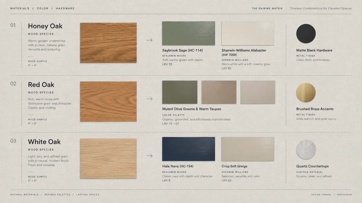
Cabinet Undertone and Paint Pairing Guide
Selecting paint colors oak cabinets complement requires balancing wall light reflection against timber depth. Use this reference table to match your cabinet wood tone with optimal paint families.
| Cabinet Wood Tone | Dominant Undertone | Best Paint Family | Top Swatch Pick | Visual Impact |
|---|---|---|---|---|
| Golden Honey Oak | Yellow and Orange | Cool Sage or Soft Gray | BM Saybrook Sage | Neutralizes brassiness and balances grain |
| Red Oak | Pink and Cinnamon | Olive Green or Charcoal | SW Dried Thyme | Tames heavy red tones with organic earthiness |
| Natural White Oak | Tan and Olive-Gray | Warm White or Pure White | BM Chantilly Lace | Creates modern Scandinavian simplicity |
| Dark Stained Oak | Espresso and Maroon | Creamy Linen or Greige | SW Alabaster | Maximizes contrast and lifts dark corners |
| Weathered Gray Oak | Cool Ash and Taupe | Navy or Muted Blue | BM Hale Navy | Adds rich depth and dramatic definition |
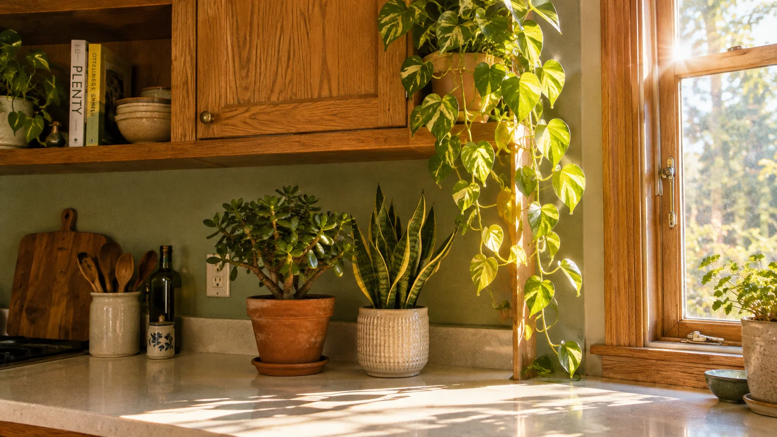
Bringing Oak to Life With Botanical Accents
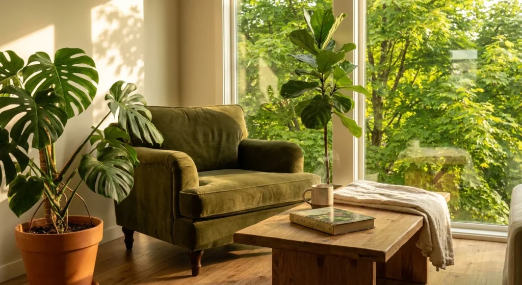
A fresh coat of wall paint updates your backdrop, but living houseplants bring natural timber to life. Indoor greenery bridges the gap between earthy oak woodwork and clean, painted sheetrock.
“A house is not a home unless it contains plants, light, and something growing.” — Anonymous
Trailing foliage softens hard cabinet angles and draws eyes upward toward crown molding. Trailing Golden Pothos (Epipremnum aureum) thrives on upper cabinet ledges under average kitchen fluorescent or LED fixtures.
If you share your home with curious pets, always select non-toxic indoor plant varieties for low shelves and islands. Check plant safety ratings using the ASPCA Animal Poison Control database before introducing new species.
The Boston Fern (Nephrolepis exaltata) thrives in humid kitchen sink zones and is non-toxic to cats and dogs. Pair it with a Pet-safe Spider Plant (Chlorophytum comosum) on open shelving for cascading, air-purifying foliage.
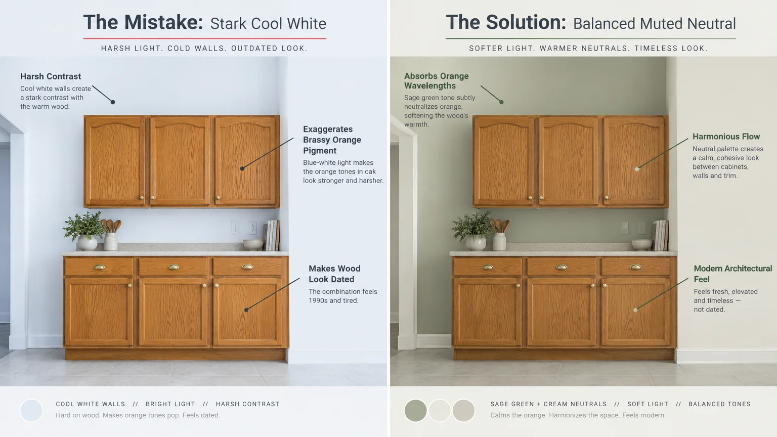
Don’t Make These Errors
Painting kitchen walls requires careful execution to avoid accentuating dated design details. Avoid these common missteps when planning your oak cabinet color schemes.
- Choosing Golden Beiges: Yellow-based beiges duplicate the worst undertones in golden oak. This combination makes your kitchen appear monotonous, muddy, and visually suffocating.
- Testing Swatches on White Poster Board: Never evaluate swatches against an isolated white background. Paint large test swatches directly adjacent to your cabinet face frames to see the true reaction.
- Ignoring Light Bulb Color Temperatures: Bulbs rated below 2700K emit heavy yellow light that exaggerates orange wood. Switch to 3000K to 3500K LED bulbs for clean, neutral color rendering.
- Selecting High-Gloss Wall Sheens: Glossy wall finishes bounce glare off uneven drywall and compete with cabinet polyurethane coats. Choose washable matte or durable eggshell sheens for kitchen walls.
- Forgetting to Clean Wood Before Painting Walls: Years of cooking grease along cabinet edges distort nearby paint application. Clean cabinet perimeters thoroughly with gentle degreasers before cutting in wall edges.
Proper cabinet prep techniques from experts at This Old House illustrate how wood care preserves your finishes during painting projects. Protecting your cabinet boxes with quality painter tape ensures clean lines and zero accidental splatters.
When It’s Worth the Investment
Pairing fresh wall paint with targeted kitchen upgrades delivers massive visual return on your investment. Swapping outdated hardware elevates your new wall color without requiring a full cabinet replacement.
Replace 1990s brass scroll pulls with modern matte black bars, antique pewter knobs, or champagne bronze handles. Modern hardware instantly breaks up monotonous oak doors and complements your fresh paint selection.
Upgrading task lighting under upper cabinets also pays substantial dividends. Crisp, energy-efficient under-cabinet LED strips illuminate your countertops and eliminate dark, shadowy recesses beneath oak boxes.
If your oak cabinet finish feels sticky, worn, or chipped, hire a wood refinisher to clean and apply a fresh clear topcoat. Restoring the natural luster of solid wood costs a fraction of full cabinet replacement.
Frequently Asked Questions About Painting Oak Kitchens
What paint color makes oak cabinets look less orange?
Cool colors with blue and green undertones, such as soft sage, slate gray, and muted navy, neutralize orange tones best. These complementary shades visually cancel out warm brassiness across natural oak grain patterns.
Can you use gray paint with honey oak cabinets?
Yes, but you must choose a warm greige rather than a cold, blue-based gray. Cool grays clash with honey oak, whereas warm greiges like Sherwin-Williams Agreeable Gray bridge the gap beautifully.
Should kitchen walls be lighter or darker than oak cabinets?
Both approaches work depending on room size and ceiling height. Lighter walls maximize light bounce and make kitchens feel larger, while dark walls create dramatic, modern contrast that frames the wood.
What is the best paint finish for kitchen walls?
Eggshell or satin finishes offer the ideal balance between scrubbability and low glare in kitchens. Flat paints absorb grease stains too easily, while semi-gloss finishes highlight surface imperfections on drywall.
Selecting the right wall color revitalizes solid oak cabinets while preserving the enduring warmth of natural timber. Pick two sample pots today, paint large swatches alongside your cabinet frames, and observe how the light transforms your space.
Plant care requirements vary by climate, soil, and growing conditions. Always confirm plant toxicity with your veterinarian if you have pets or young children.
Last updated: October 2026. Plant care guidance reflects current horticultural best practices—always observe your specific plant’s signals.