Did you ever think you have made a paint color mistake?
When it comes to paint color mistakes, there have been more homeowners who have made them than those who got things right the first time.
Indeed, you can generally avoid making any if you just choose to make all the walls in your home white, but even then, there is a high chance that something will come along and ruin your plans. Case in point: the fact that your home can end up looking dirty!
Upkeeping the cleanliness in your home can sometimes be a challenge, especially since we do not always have the time to clean as thoroughly as we would like to. Making a paint color mistake can make it seem that even when you have cleaned your home, certain rooms end up looking dingy or dirty!
Picking the right paint color (down to the undertone of the color) is the key to making sure you do not end up with a disaster on your hands and have to spend even more money to change the mistake you have made!
We have gathered insight from decorating experts and interior designers on which are the worst paint color mistakes you could make that would make your home look dirty (no matter how much time you spend cleaning the space) and which colors or undertones to trust instead!
Yes, this means you can still go with your best bet on white, but this time you will know which one is the best one! And we got your back, even if you like to have more color present!
What is the worst paint color mistake you have made? How did you fix it? Share your story in the comments below!
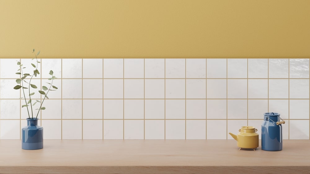
Hard to get right: Yellows!
Your favorite color may be yellow, and you may be counting on it to brighten your spaces, but it only takes one wrong paint color shade to ruin your whole room and make it seem dirty instead of bright and open.
In reality, it is hard to pick a good yellow shade, even if you go for a brighter one than you anticipated first.
If you pick a too-bright shade, then it can feel too bright, and your mind can be overstimulated even when you want to calm down.
If you end up with too muted yellow, it will end up looking dingy and pale, more akin to discolored or dusty yellowed linen. None of these options bode well for making your home seem clean and open.
This does not mean that you should give up on yellow shades. If this is truly the color you want to go for, make sure that you search for a soul-soothing and calming yellow, which is more pastel and muted than you may imagine. The best ones look creamy white and not yellow on the swatch or even in the paint can!
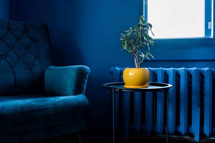
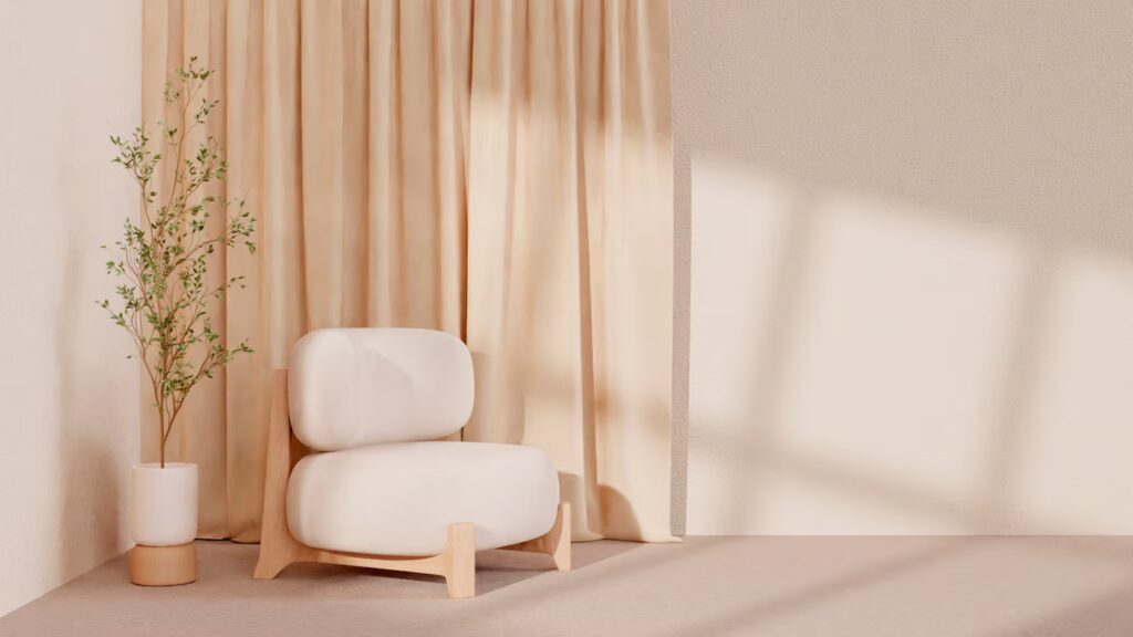
Be careful of Warm Whites!
Speaking of whites, you can still get these wrong, and the wrong lighting can end up making your home look dirty. This generally ends up happening when it comes to warm undertones in shades of white.
A lot of interior decor specialists end up choosing shades of white for the walls of the homes they design unless they request other colors since it is a natural choice and you can easily match it with different furniture shades and decor.
White walls end up making the space feel open and clean, and they reflect light, which makes this paint color one of the most sought-after. Yet, if you end up with a brown or yellow undertone, your walls will end up not giving the same look you are looking for.
These warm undertones are more fit for a vintage look, and if you do not have this in mind when you decorate, it can end up looking like your walls used to be white, but due to time and wear, they have yellowed!
Be careful when choosing whites so that you do not end up making your home look dirty despite it being freshly painted!
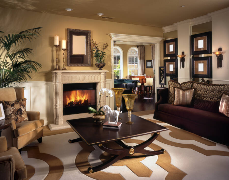
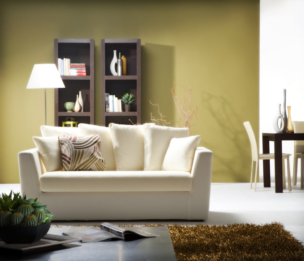
Beiges are more of a headache!
Neutrals are some of the most popular paint colors for walls, but when it comes to one of the most popular ones, beige, many do not manage to get it right.
The common misconception is that it is easier to keep clean than white, but the truth of the matter is that it is just as annoying, if not more so. Beiges can end up looking muddy and dirty instead of natural and pleasant.
And when it comes to these, there are two beige shades you need to avoid at all costs: builder’s beige (which is just extremely dusty) and a lot of muted beiges. These make for horrible wall colors, and if you want to use them only on the ceiling, designers beg you to reconsider.
Beiges and many other neutrals may seem attractive, but they can also hurt the value of your home or your chances of finding renters since they give the impression of a dirt cast.
Any khakis, along with beiges with yellow and green undertones, are paint colors to avoid, as they are not flattering in most lights!
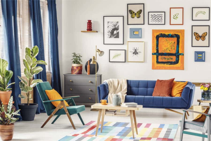
Pinks are more often than not a struggle!
Yes, pinks can be a great way to bring more color to a room. Yet, as a paint color, it can pose a lot of struggles to bring you the desired effect, much like we discussed with the yellow hues.
The lighter shades can feel too bright and sickly sweet, while the more muted and muddy ones are going to be easier on the eye but also give off the impression of a dry wall.
You are in luck if you have been thinking about pink walls, as the trends have been going towards neutral pinks, so the right ones are not as hard to find as they once were (give Farrow & Ball’s Sulking Room Pink a try since it seems to be one of the first choices of professionals).
One thing to be careful of when choosing pink shades is to consider if the room is at fault for the dirty feeling. The paint color you may have chosen may have been good, but old paint colors may haunt you. By that, we mean that you are repainting, and the old color seeps through the new one!
When repainting, make sure you use a high-quality gray or white primer so that you do not have to deal with colors seeping through. This one here is our favorite primer and it works wonders!
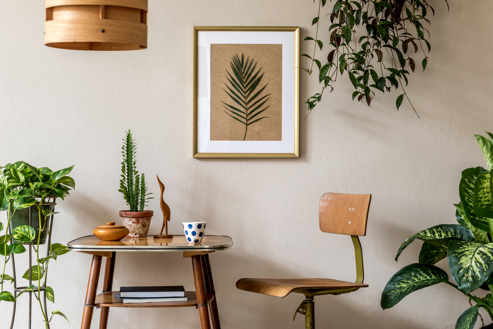
Not all greens are created the same!
We have talked about the danger of yellow undertones in your neutrals and your whites, which can and will give off the impression of a dirty home, but we also have to talk about green shades.
This paint color has become more and more popular in the last couple of years, yet you need to be careful about which one you choose. The first instinct to choose a pale green is not going to fly, as it can very well give off the impression of a sick room, and it can also make individuals in the room seem sicker, as it casts a pallor onto people.
A lot of people also gravitate towards mint green or sages, but these can also end up being muddy and dingy if they are way too yellow, so the professionals recommend you sit them out.
There is a new paint color that has become the latest trend when it comes to green. Hunter green is going to look amazing in most homes, especially if you are trying to preserve the historical value of one, but it also goes well with a modern outlook!
Either way, you should be looking for blue undertones in your greens so that you give off clean instead of dirty bives!
Speaking of struggles, be careful with earth tones!
And since we have talked about struggling with paint colors, we cannot skip mentioning earth tones. This is not true about all of them, but there are a few of them that are going to make your home look dirty.
In particular, you should use these colors in rooms that you know will tend to be more messy. The ones you should be careful of include tan, brown, and even some terracotta colors. These will make the room even more cluttered and dirty than it would be at first glance.
Yet, if you truly like these shades, why not consider an acceptable wall with them instead? It will be easier to maintain and clean, and you will not have to deal with a dingy look!
These are just some of the colors you need to be careful with when choosing them. However, sometimes they can have different reactions, as colors can also make your spaces seem brighter and bigger! If you are curious about what colors would be best for a kitchen that is on the tiny side, give our article here a read!