Color is more than just a visual experience. It has a big psychological impact on our moods, behaviors, and perceptions. Psychologists have long studied the effects of color on the human mind, and their findings can be a powerful guide when choosing the best colors for our living spaces. Selecting the right colors for each room in your home not only enhances aesthetics but also contributes to emotional well-being, productivity, and relaxation.
Our environments play a big role in shaping how we feel and act. The color of a wall, a ceiling, or even a small decor element can either soothe or stimulate, inspire or overwhelm. Recent studies uncovered how different colors can cause different emotional and psychological responses. Blue may lower heart rate and instill a state of calm, while red can elevate energy levels and arousal. Homeowners and designers use these responses to create rooms that fulfill their purposes, whether that be a tranquil retreat, a lively gathering space, or a productive workspace.
In an age where mental health and well-being are more and more important, color is a subtle yet powerful tool that can support a healthier lifestyle. With so much of our lives spent in our homes and indoor environments, creating relaxing spaces has become more relevant than ever. Here’s an in-depth exploration of the best colors for each room in your house, grounded in psychological research.
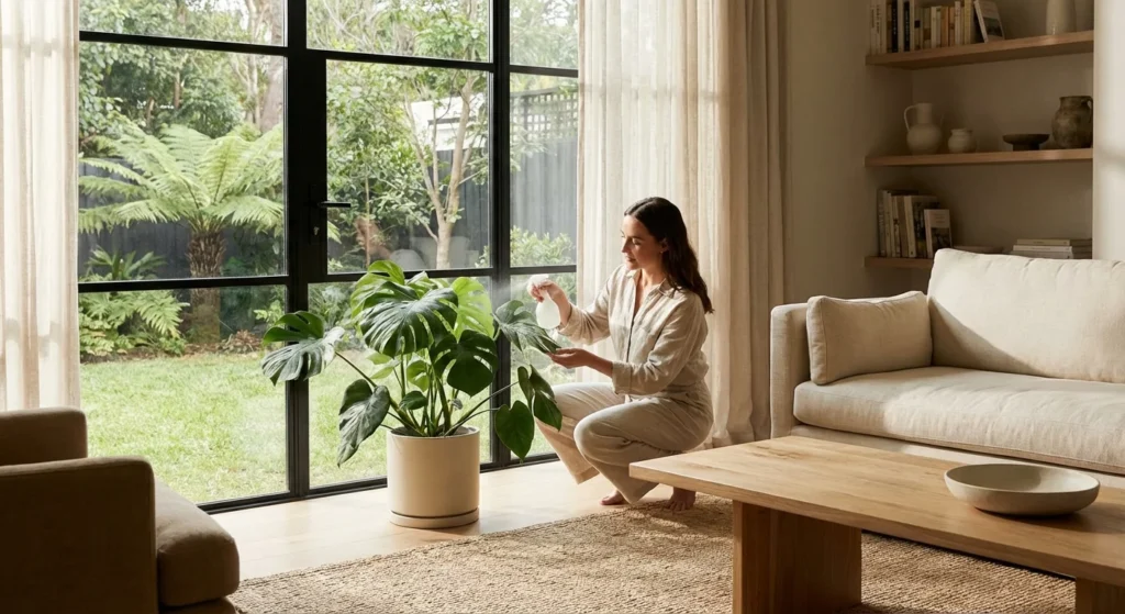
Living Room: Warm Neutrals and Earth Tones
The living room is typically a communal space where families gather and guests are entertained. According to psychologists, the best colors for this area are warm neutrals and earth tones, such as beige, soft browns, warm grays, and muted greens. Warm neutrals evoke stability and comfort, while earth tones mimic natural environments, which can create a calming and welcoming atmosphere. These colors are not intrusive, allowing for flexibility in decor and seasonal changes.
Colors like beige and taupe have been proven to reduce anxiety and promote relaxation, making them ideal for shared spaces. If you want to make your living room even cozier, thoughtful lighting combined with these tones can create a golden hour ambiance that will enhance the room’s warmth.
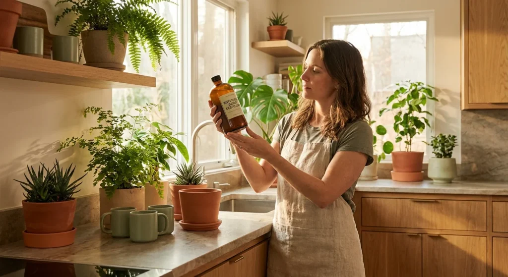
Kitchen: Yellow, Orange, and Soft Green
The kitchen is the heart of the home, often associated with nourishment and warmth. Psychologists suggest that stimulating colors work best here. Yellow stimulates appetite and enhances feelings of happiness. Orange adds energy and excitement, making mealtimes more lively. Soft greens can give the room a refreshing and clean ambiance.
These tones mirror natural produce like citrus fruits or fresh herbs, which subconsciously give a sense of health and vitality. Warm colors are linked to increased appetite and conversation. However, balance is key. Overly bright shades can become overwhelming, so softer tones or accent walls are often recommended.
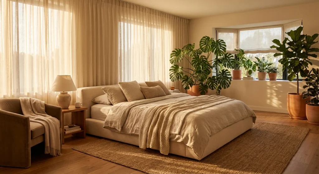
Bedroom: Blues, Lavenders, and Soft Grays
The bedroom should be a sanctuary for rest. Cool, calming colors are ideal for creating a good environment to rest. Blues is widely recognized for its calming effects and is linked to lower blood pressure and heart rate. Lavender brings a subtle touch of color while maintaining the tranquility. Soft grays can serve as a peaceful backdrop without feeling cold or sterile.
Studies show that people that sleep in blue bedrooms have a better sleep quality. Lighter shades tend to be more effective in creating a serene atmosphere. To deepen this ambiance, you should consider layering textures with plush bedding, curtains, or rugs in similar cool tones.
Bathroom: Light Blues, Greens, and White
Bathrooms benefit from colors that evoke cleanliness, freshness, and a spa-like feeling. Light blue gives a sense of relaxation. Soft greens are associated with nature and health. White represents purity and simplicity, making the space feel more open and airy. Cool tones can make a bathroom appear larger and more inviting. A combination of white with subtle blue or green undertones can transform the space into a relaxation retreat. To heighten this effect, you should use reflective surfaces such as mirrors or glass, along with greenery or natural stone elements.
Home Office: Greens and Blues
With more and more people working from home, the design of a home office has become very important. Productivity and focus are key factors. Green is known to reduce eye strain and increase efficiency, while blue promotes focus and clarity. Research indicates that green environments improve concentration and creativity, while blue tones support mental clarity and decision-making. A mix of these colors can be very effective in enhancing work performance.
To create an optimal workspace, integrating plants, wooden textures, and daylight exposure can complement these colors beautifully. These elements reduce stress, promote mental stamina, and enhance overall job satisfaction while working from home.
Dining Room: Red and Warm Tones
The dining room is another space where social interaction and appetite are very important. Warm colors can create a stimulating and engaging environment. Red is well-known to stimulate appetite and conversation. Warm browns and terracotta shades add a touch of sophistication and intimacy.
While red can be energizing, it should be used carefully, maybe on a single wall or through accents. Pairing these colors with ambient lighting, textured walls, or rustic wood furnishings can create an intimate ambiance of a fine-dining experience.
Children’s Room: Soft Pastels and Bright Accents
Children’s rooms should be stimulating yet soothing, encouraging both play and sleep. Soft pastels like mint, green, lavender, and pale pink are calming. Children are highly responsive to color, and balanced palettes can help regulate mood and behavior.
Using too many bright colors can be overstimulating, so use them sparingly. You should include themed pieces of decor, adaptable furniture, and interactive wall elements such as chalkboard paint or wall decals. This way, you’ll allow the space to evolve with the child.
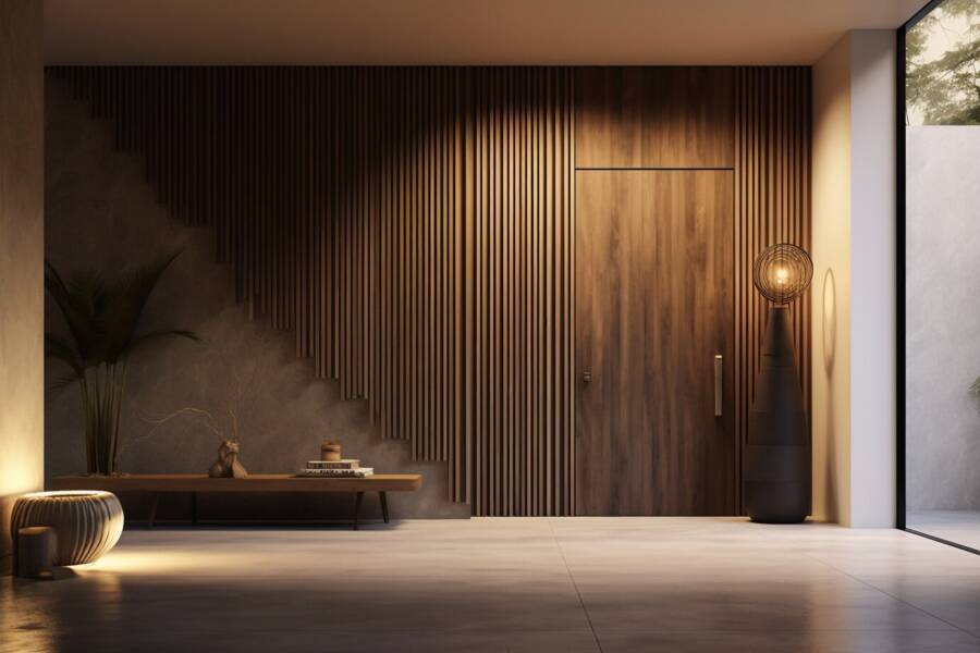
Entryway: Muted Blues, Greens, and Warm Neutrals
The entryway sets the tone for the entire home. A welcoming color palette can create a lasting first impression. Muted blues and greens suggest peace and harmony. Warm neutrals like taupe or sandy beige make the space feel inviting. These colors can reduce anxiety and provide a smooth transition from the outside world into the home. They signal comfort and security. In this space, you should use natural textures, soft lighting, and curated wall art. The entryway becomes a bridge between your personal world and the outside one, grounded in calm and positivity.
Final Thoughts
Choosing the right colors for your home involves more than just aesthetic preference, it’s about understanding how color impacts your emotions and behaviors. Psychologists agree that careful color selection can promote happiness, productivity, and relaxation throughout your home. While personal taste should always play a role, taking into consideration the psychological effects of color ensures that your home supports both your mental and emotional well-being.
From soothing blues in the bedroom to energizing yellows in the kitchen, every shade has the potential to shape your experience. Even small changes in tones can have big effects on your sense of peace and motivation. So next time you pick up a paint swatch, think beyond the surface because color truly matters. Making these changes, your home can become more than just a place to live, it can be a space that nurtures your mind, body, and spirit each day.
Want to learn more about color theory in interior design? Try reading this book. It will teach you how to use the color wheel effectively, master color psychology, create mood and atmosphere, and incorporate colors like a pro.
Read also: 10 Bold Colors That Fit PERFECTLY in California Homes