Choosing the right paint color might be one of the most thoughtful steps in your decorating journey. You’re drawn to get inspiration from other homes, and what better models you can get than the house of an interior designer? We managed to bring you some of their top picks and stories, to successfully guide you into choosing the best color.
Let’s see what an interior designer loves to use for its own space. We covered everything, from neutrals to vibrant shades for a bold character.
Simply White – color or non-color?
Benjamin More’s simply white is a popular option that stands out for fitting various design styles and room types. Interior designer David Frazier used this for his living room walls, providing the perfect neutral to highlight his furniture and accents.
David believes that this is the perfect warm white that creates an ideal neutral canva for the elements in your space. Simply white contains a soft yellow undertone that keeps it crisp without feeling too stark. This is an excellent choice if you were thinking about a white that doesn’t look too austere and offers a balanced and inviting atmosphere.
Studio Green
In his bedroom, David Frazier opted for a technique of color drenching using Farrow & Ball’s Studio Green. What he did here, was that he painted both the walls and the ceiling, offering depth and creating a bold, serene atmosphere. This approach is a statement itself, but it envelops the space with coziness as well.
He sees this color as being rich, green-black exuding depth and character. This deep hue adds richness to any room, making it an excellent choice for those who want to create a dramatic, but still calming environment. This color can shift from dark green to an almost black tone, based on the light enhancement, which makes it amazingly versatile and appealing.
Wythe Blue
Sarah Vaile, a Chicago-based interior designer, opted for the entryway of her home a gentle blue-green shade named Whyte Blue, from Benjamin Moore. This color is a refreshing alternative to typical neutral tones.
In her perspective, Wythe Blue is a kind of palette cleanser that is subtle enough to act as neutral but brings a lot of depth and personality to the space. The soft hue comes with a touch of identity to the space and maintains a calming and understated sense, so it’s a perfect choice for people who want to add a hint of color without looking like it’s too much.
Portola Paints
Austin Carrier and Alex Mutter-Rottmayer from Hommeboys Interiors share that their home features a blend of lime wash, Venetian plaster, and Roman clay.
They love to work with Portola Paints thanks to their unique custom shades that bring uniqueness to every room. The limewash they use is an excellent choice for people who seek to introduce natural texture and an organic feel to their space. You can create many variations from this one and you will subtly add character to any room.
Lido Pink, The Pickleson Paint Co.
Designer Matthew Williamson used for his house a range of colors starting with the vibrant Lido Park from The Pickleson Paint Co. in his livingroom.
He describes the walls painted in Lido Pink as a soft blush hue that contrasts beautifully with the crisp white ceiling, creating a delightful and unexpected pairing with the color he painted the widow frames and woodwork with – Hackney Gold, also from The Pickleson Paint Co.
The reason why he chose to go with this blush or pastel pink is because it’s a neutral color that is a little bit different. Lido pink managed to be exactly what he was looking for and it’s more forgiving and inviting than white, warmer than grey, and more playful than beige. This is the perfect pick if you want a room with a layer of warmth and personality.
Tequila Green
Mathew Williams also talks about Tequilla Green, another shade from The Pickleson Paint Co. He uses this one for his bedroom, and as we saw green in the bedroom before, this one is totally special. The walls are painted in Tequilla Green, while the ceiling, skirting boards, and shutters end up in Basilica green, a deeper gloss shade, creating an overall stunning impact.
What Mathew likes about this bedroom is the fact that it features an eclectic mix of artwork, rugs, bed linens, and plants that are unified by the color green. He uses green for his space because it enhances his sense of well-being, and the Tequilla Green with its mid-tone mint creates the perfect balance between crisp and striking, maintaining a serene atmosphere. That was his ideal choice for a bedroom. Now you may think about what is yours: what vibe you want to create, how you want to feel, and what visual impact you would like to experience when stepping into your bedroom.
Hague Blue, Farrow & Ball
Bambi A’Lynn Interior Design owner shared that her all-time favorite paint color is Hague Blue by Farrow & Ball. She highlights that this shade has remarkable versatility and it’s a superb choice for offering different effects depending on the space.
Most of the time she chooses this color for dining room walls, doors, or bars, due to its rich, deep tone. Bambi notes that Hague Blue is a great shade for enhancing both traditional and contemporary spaces, pairing beautifully with a wide range of materials such as warm woods or metallic accents.
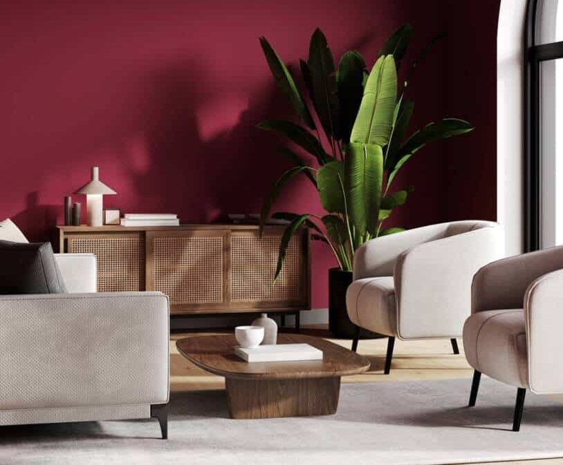
Love Affair, Benjamin Moore
Designer Amber Guyton likes to introduce a touch of sophistication to her living room by painting it in Benjamin Moore’s shade called Love Affair, mixing it with neutrals She talked about her work saying they they painted about 5 feet up the walls in this color.
It’s a mauvy merlot that adds a rich and welcoming tone, not only enchanting her guests but also creating a relaxing ambiance for herself. Amber’s choice is proof of how a bold color can complement a more subdued palette, as it adds depth and character to a space.
Keep in mind to test samples in your space before making the final decision and see how lighting and room conditions alter how a color appears.
If you’re a color enthusiast, here you have a Pantone 2022 Edition Coated and Uncoated Guide, Multi-Colour.
We let you with some tips on how to choose the right color for your house
- First things first, you should think about the room’s purpose. You can go for soft greens or blues for the bedroom, or use energizing colors like yellow or bold red to create a lively kitchen or dining area.
- Consider the color of your furniture, as well as the other elements like flooring and decor, to have a final cohesive look.
- Think about the color flow when you paint multiple rooms and choose colors that work well together to create harmony in your home.
- Reflect on what mood and atmosphere you want to evoke through the colors. For example, cool tones of blues and greens create a serene atmosphere, while warmer tones like red and oranges can be stimulating, depending on their intensity.
- Always test paint samples on your walls to see how the color changes throughout the day in different lighting solutions.
- As you consider light, test the color both in natural and artificial light to see how they truly appear
- Consider the size of the room, and keep in mind that lighter colors can help with enlarging a space and darker shades have the purpose of creating a cozy and intimate environment.
If you found our article useful, take a look at this one next: If You Don’t Like Red in Your Garden, Read on…